

NICA Annual Conference 2027
CASE STUDY: Translating a Strategic Vision into a Conference Brand
Defining the Next Frontier
For NICA’s 2027 Annual Conference, Dallas offered a new setting—and an opportunity to express where infusion care was heading. The challenge was to connect the destination with NICA’s strategic vision for innovation, access, and growth.
NICA’s creative brief established “The Next Frontier” as the direction, positioning Dallas as an operations hub for a healthcare industry preparing to deliver the next generation of infusion therapies. The identity needed to convey the infrastructure, connections, and capacity that progress would require.
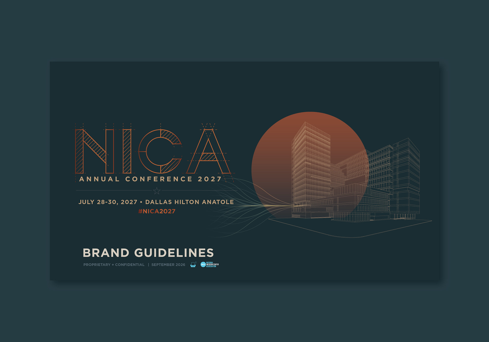
LMI+D translated that vision into a visual language of architecture, drafting lines, and connected networks, anchored by the message “Built for What’s Next.”

Giving the Strategy a Visual Form
The design draws on the visual language of planning and construction. Drafting lines shape the custom NICA2027 lettering, while an architectural illustration of the Hilton Anatole connects the identity to the Dallas venue. Flowing network lines extend across the composition, suggesting the connections that support an expanding infusion care system.
Deep petrol and steel blue establish a structured foundation, balanced by warm neutrals and copper tones. Together, these elements give “Built for What’s Next” a distinct visual expression and establish a system that can carry across conference communications.


Turning the Identity into a Working System
With the visual direction established, the next challenge was to make it usable by everyone contributing to the conference. NICA’s team, event partners, sponsors, and exhibitors needed clear guidance for applying the identity across different materials.
LMI+D organized the digital guide into four sections: The Brand, Using the Brand, Visual Identity, and Asset Library. The structure connects the conference’s strategic message with practical standards, partner instructions, and approved assets—helping contributors find what they need and understand how to use it.

Giving the System Room to Adapt
The identity needed to work across applications with very different demands. Typography standards establish a clear hierarchy for information, while the architectural illustration, drafting motifs, and color palette offer flexibility in how the brand is expressed.
The merchandise concepts demonstrate that flexibility. Each uses a different combination of the logo, compass motif, and colors, showing how individual pieces can remain connected without repeating the same layout.


A Foundation for the Full Conference Experience
The completed digital brand guide translates NICA’s strategic vision into a coordinated identity and a practical reference for implementation. It brings messaging, visual standards, partner guidance, and approved assets together, establishing a consistent foundation for conference promotion, attendee communications, and the on-site experience.
The Outcome
From Strategic Vision to a Cohesive Conference Brand
LMI+D translated NICA’s vision for the future of infusion care into a distinctive conference identity and a comprehensive guide for putting it into practice. The completed system connects the strategic message with the details of implementation, giving staff and event partners a clear framework for creating materials that belong to the same experience.
With the identity and guidelines established, NICA has a visual foundation that can grow with the conference—from its first promotional announcement to the environments attendees will experience in Dallas.
PLANNING YOUR NEXT CONFERENCE?
Let’s build a distinctive identity that connects the entire experience.
Let’s build a distinctive identity that connects the entire experience.