

Loud Cow Strategy Group
Case Study
Design that’s anything but quiet.
Design that’s anything but quiet.
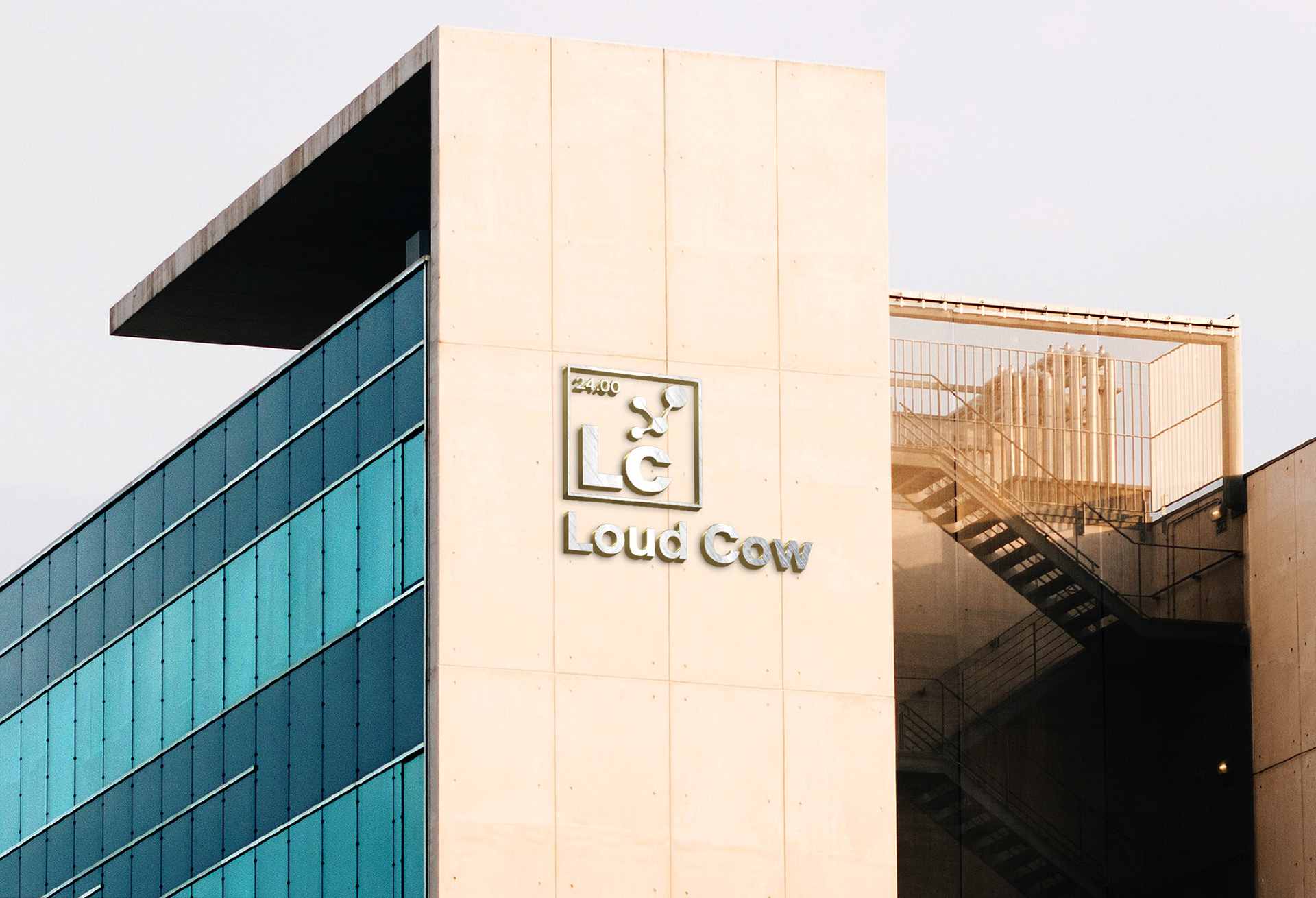
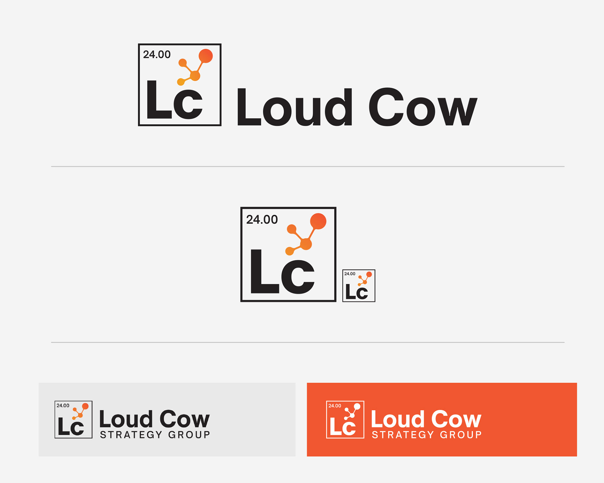
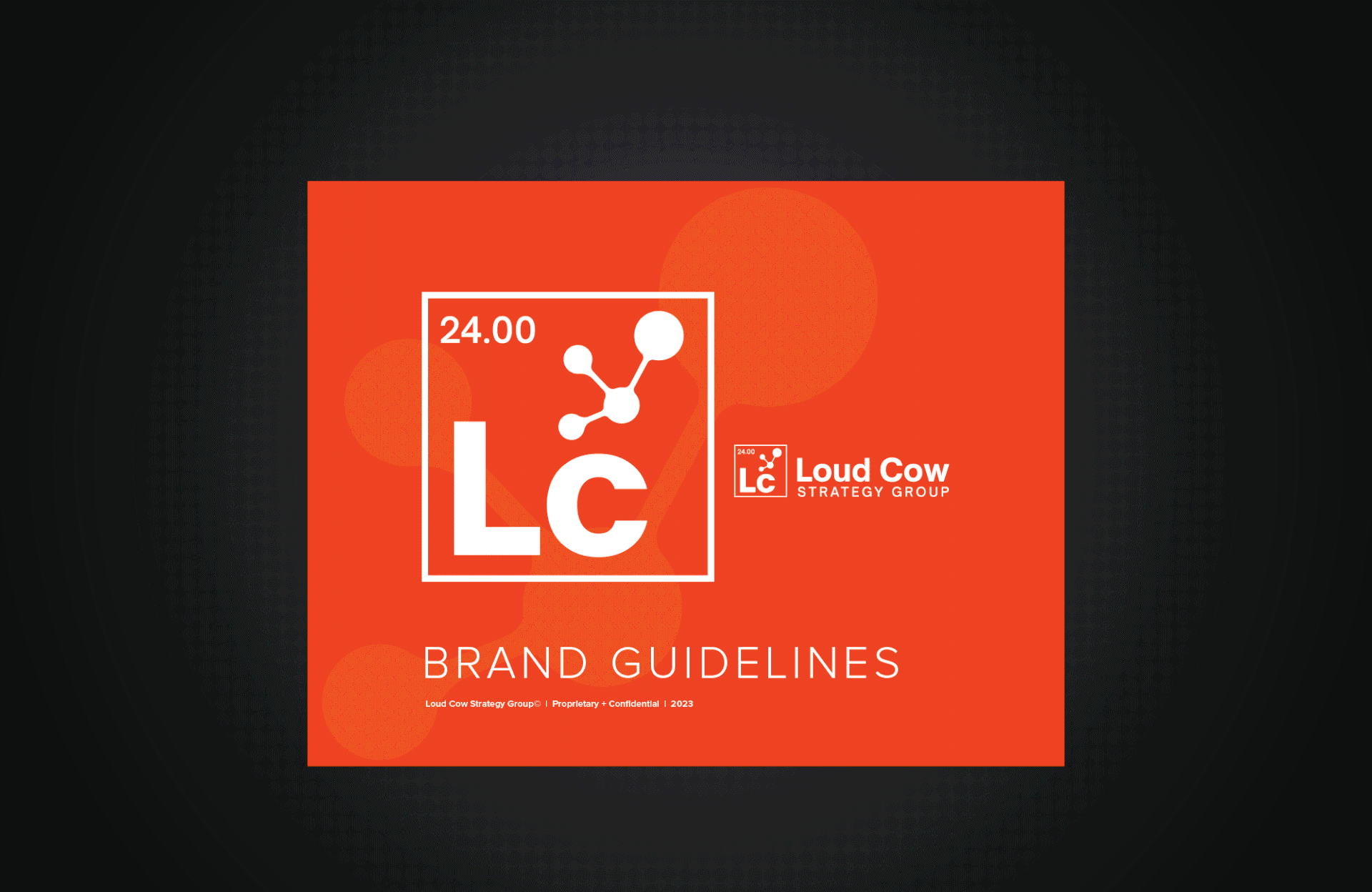
The Loud Cow Strategy Group logo has its own place in the periodic chart of elements along with its own atomic weight of 24, the gauge of the needle used for intramuscular, subcutaneous, and other injections. The added atom reflects the movement and evolution of science, invention, discovery and medical advancements.
Services Provided
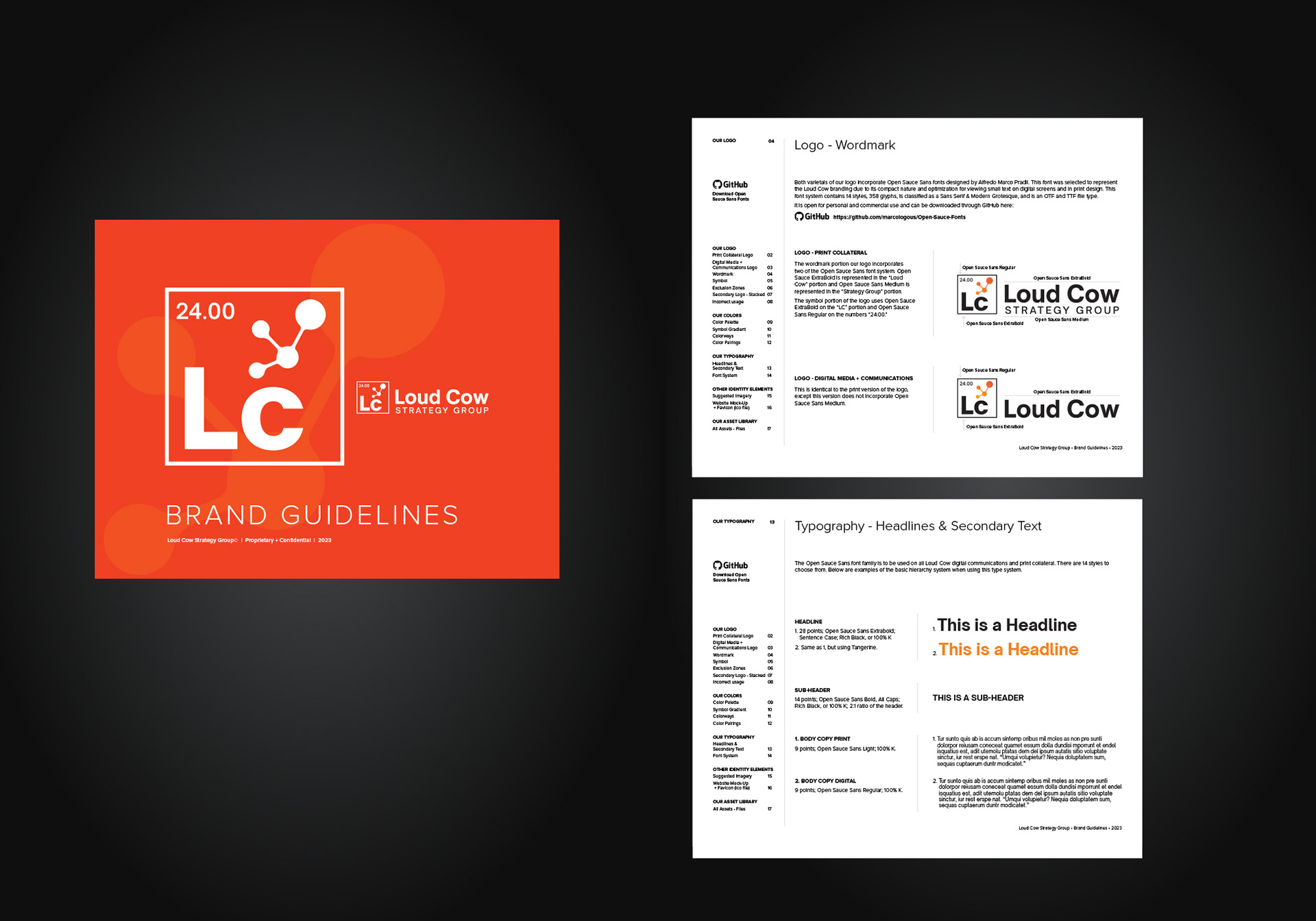
Logo Design | Brand Identity System | Brand Guidelines
Concept Development | Visual Strategy
Concept Development | Visual Strategy
The Challenge
Loud Cow is a bold healthcare consultancy with an unconventional name and a strong point of view. They needed a brand identity that matched their unapologetic, high-impact style — something that would speak to decision-makers in the healthcare space while still feeling untraditional and unexpected.
Our Approach
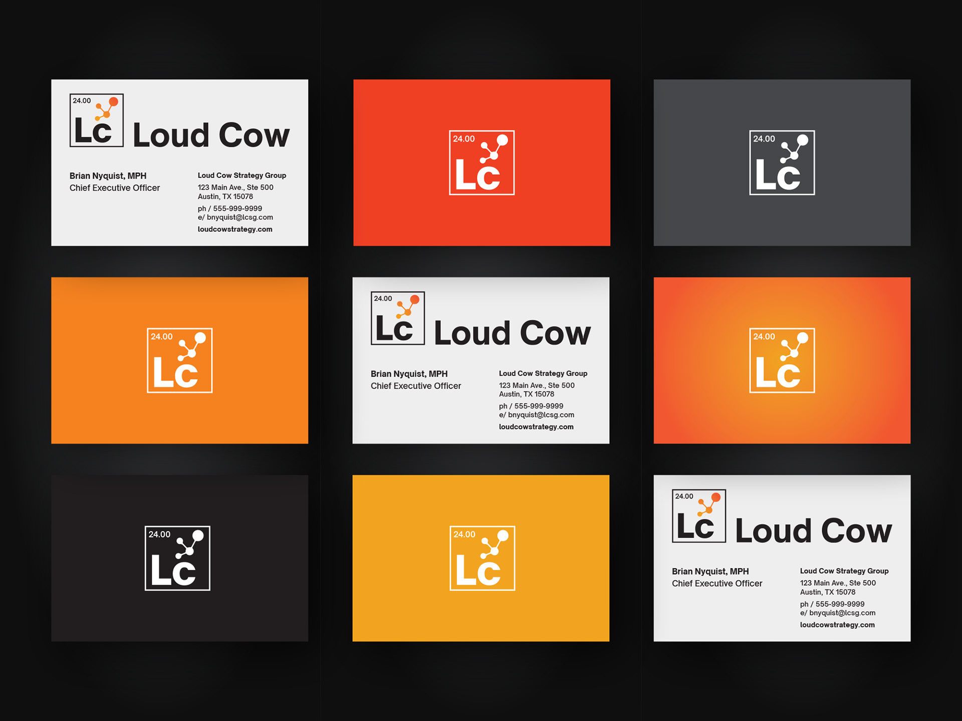
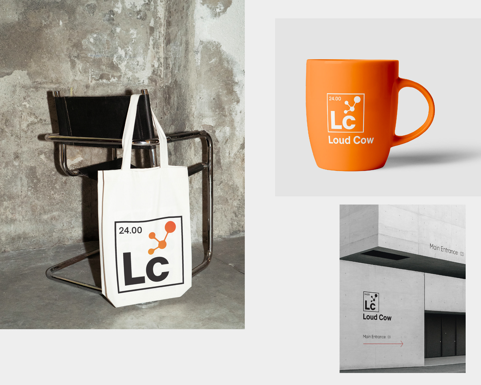
LMI+D created a distinctive visual identity inspired by the periodic table of elements — symbolizing intelligence, chemistry, and foundational strength. We paired this concept with an atomic motif to evoke energy and disruption. The result is a brand that feels scientific, modern, and dynamic. We expanded this into a cohesive identity system and brand guide designed for both print and digital touchpoints.
The Outcome
The final identity helped Loud Cow confidently position itself as a standout player in the healthcare consultancy space. The bold logo and clean system communicate authority, clarity, and the firm’s unique personality. The brand toolkit created by LMI+D continues to serve as a foundation for future growth and brand expression.
Ready to elevate your brand?
Let’s talk about how smart, strategic design can help your business stand out — and scale with confidence.
Let’s talk about how smart, strategic design can help your business stand out — and scale with confidence.