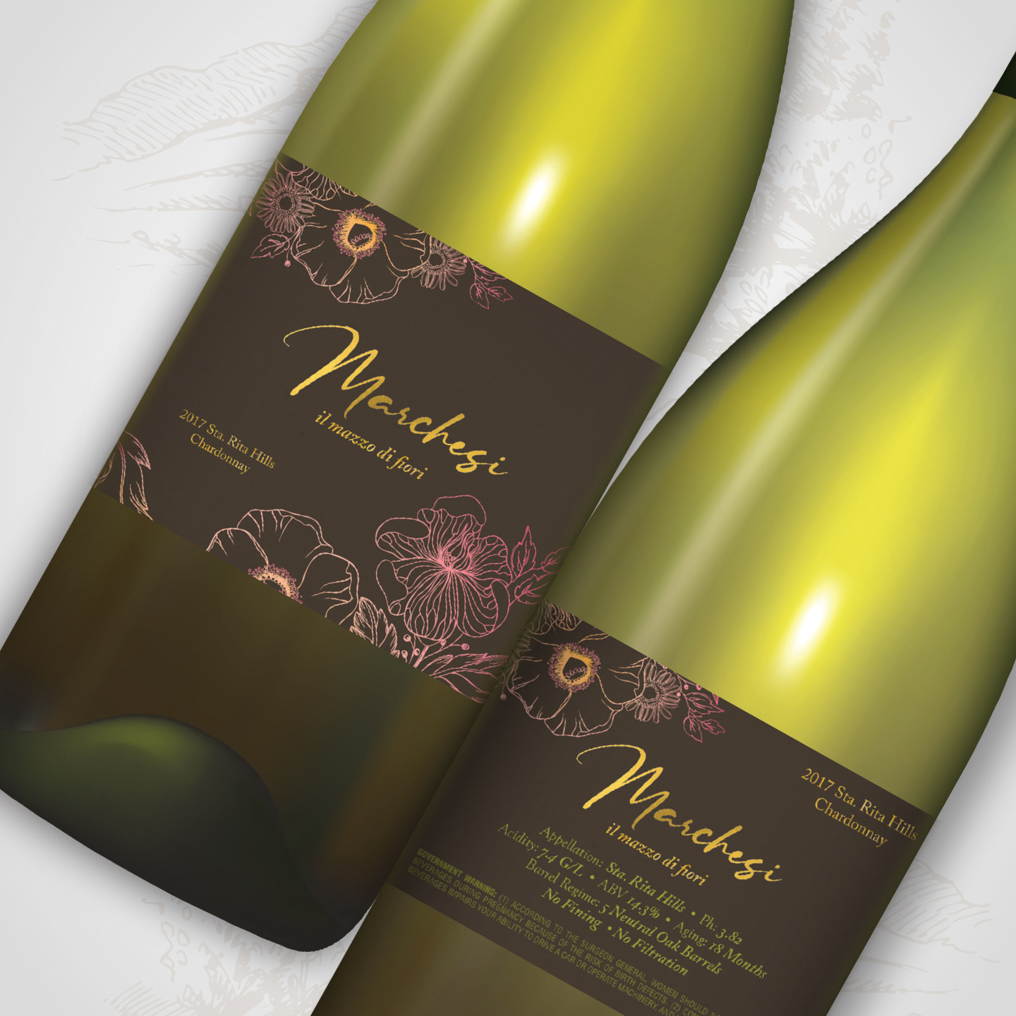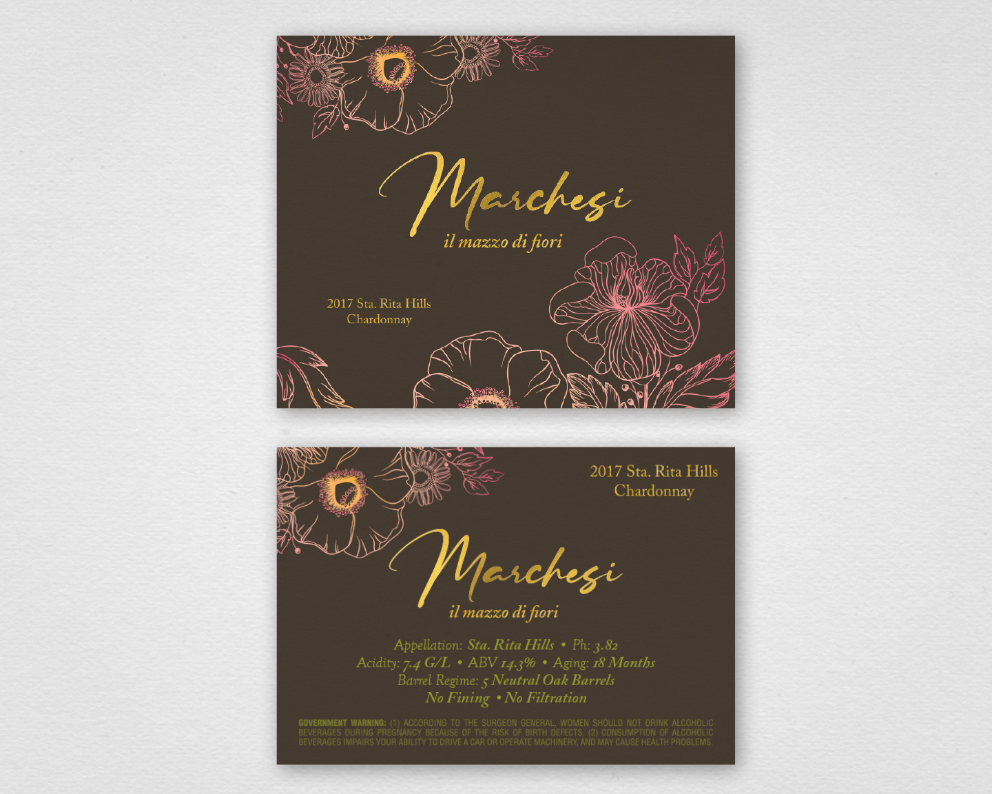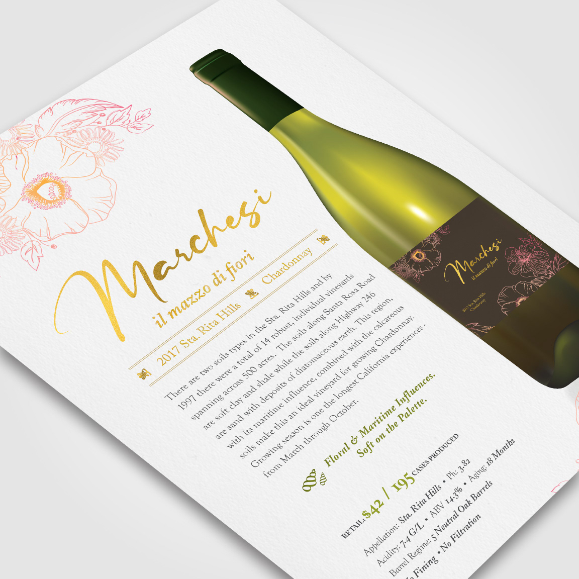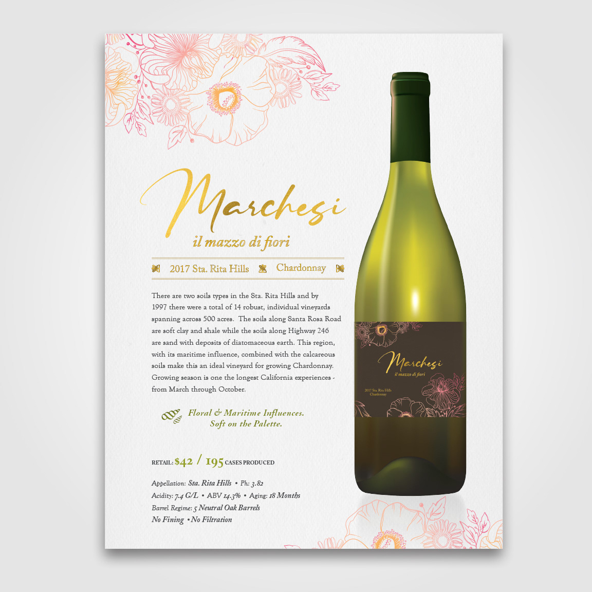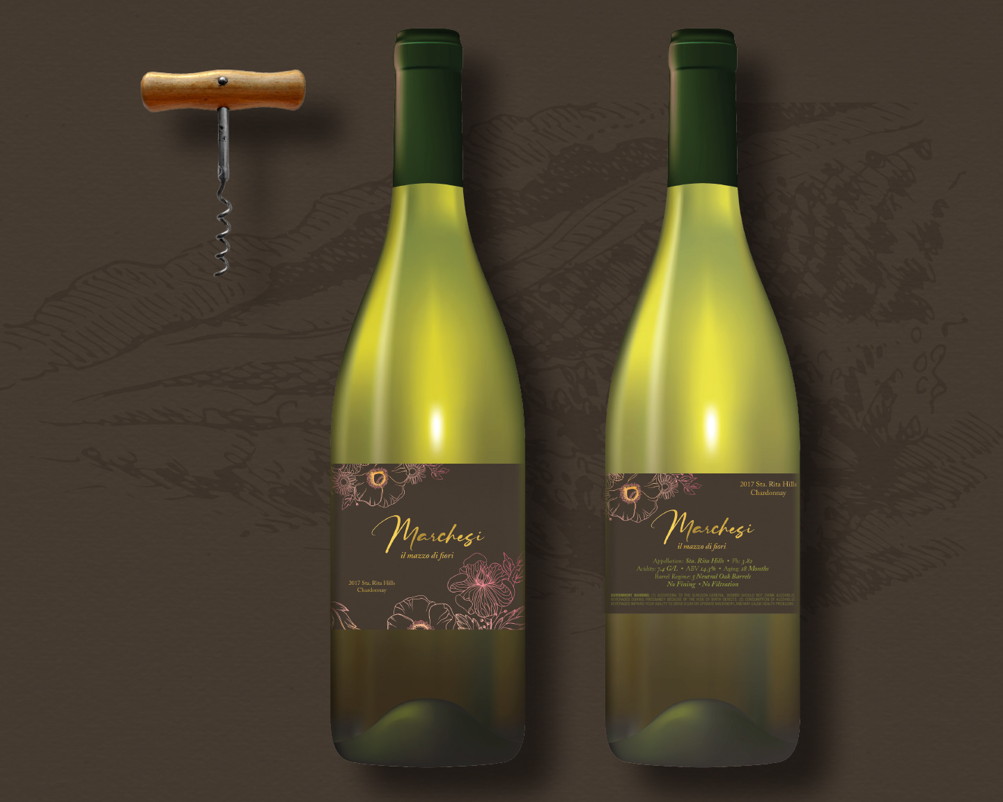

Marchesi 2017 Chardonnay –
il mazzo di fiori
il mazzo di fiori
Case Study: Creating a brand for a limited-edition, small-batch chardonnay.
The Marchesi family isn’t new to making wine, but is new in the Sta. Rita Valley region and to American markets. The creative design process began with conversations on skype followed by in-person east-coast meetings held in New York City.
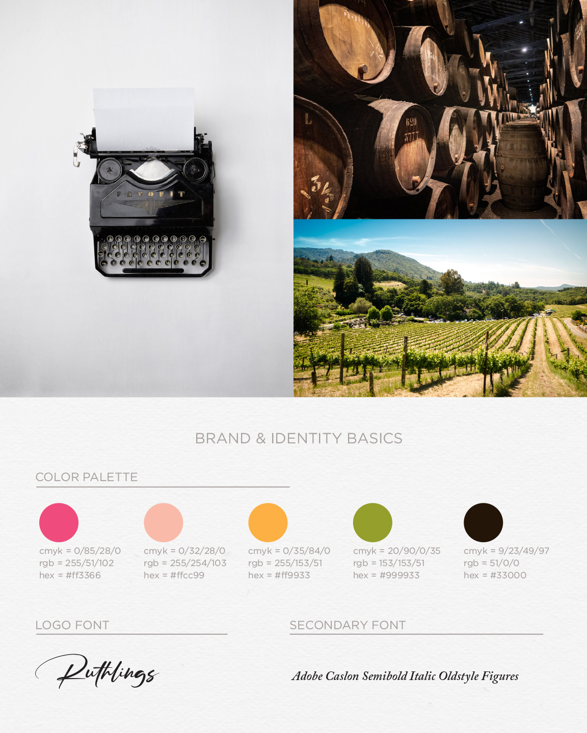
LMI+D created a modern floral design to communicate the meaning of “il mazzo di fiori”. Translated from Italian, it means “the bouquet of flowers.” Soft, feminine colors of pinks and peaches colored the line drawings of the illustration. Gold foil was used prominently against the deep brown label to capture attention, romance, and the feminine quality of this offering. Rosario (Marchesi) was instantly captivated by the simplicity. Bellissima!
#wine #winelabeldesign #winebrand #vino #winelover #sommelier #chardonnay